
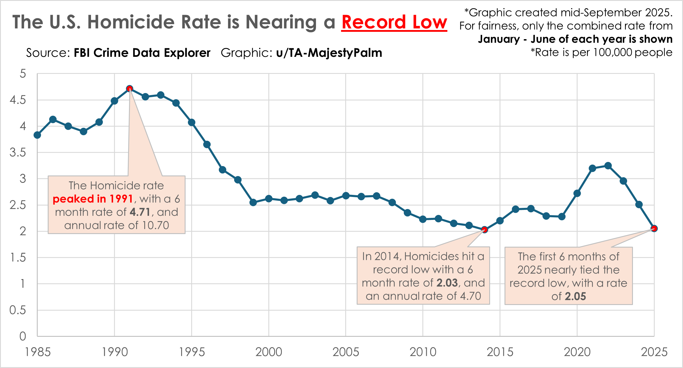
Graphic created by a redditor using the FBI Crime Data Explorer: https://cde.ucr.cjis.gov/LATEST/webapp/#/pages/explorer/crime/crime-trend
In light of the seemingly constant reports of violence in the news, the author set out to examine how today’s homicide rate compares to historical trends.
Why display a six-month (January–June) rate instead of monthly or yearly data?
-
A full-year comparison wasn’t used because 2025 is still underway. However, the author still wanted to provide a way to compare the current year with previous ones.
-
Monthly data was avoided due to inconsistencies in how law enforcement agencies report. Some only report annually, which leads to artificial spikes in December, as seen in the source data.
-
The January–June range was selected to minimize distortion from incomplete or lagging data reporting in the most recent months. For instance, the source data shows a sharp drop-off starting in August/September, indicating that data collection is still ongoing.
Bonus: A yearly homicide rate chart can be viewed here (note that 2025 appears lower due to incomplete data from recent months): https://www.consumershield.com/articles/murder-rate-by-year